Case Study
Case Study
Netflix Feature: Simplifying the Sunday Film Search Experience
Netflix Feature: Simplifying the Sunday Film Search Experience
UX/UI Design
UX/UI Design

The Overwhelming Choice Dilemma
The Overwhelming Choice Dilemma
Netflix is renowned for its vast library of films and TV shows, but this abundance often leads to a paradox of choice. On countless Sunday afternoons, users scroll endlessly through the options, struggling to settle on something to watch. Research supports this difficulty; Hick's Law shows that when presented with more options, decision-making becomes increasingly challenging.
After conducting a survey, I found that 87% of users admitted to spending over 40 minutes searching for something to watch, with many expressing overwhelming feelings due to the sheer number of choices. To alleviate this, I designed a new feature: a recommendation quiz that guides users based on their moods and preferences, ultimately simplifying the decision-making process.
The Challenge: Reducing Decision Fatigue for Netflix Users
The Challenge: Reducing Decision
Fatigue for Netflix Users
The primary challenge Netflix users face is decision fatigue—spending excessive time scrolling through numerous options only to feel disappointed by their final choice. The vast selection on Netflix's homepage makes it difficult to quickly pick something enjoyable, especially for users in specific moods or with limited time.
My goal was to design a solution to streamline this process by asking users a few simple questions and offering recommendations tailored to their current mood and viewing preferences.
Crafting a Feature That Engages
and Simplifies
Crafting a Feature That Engages
and Simplifies
My design was inspired by the concept of user-centred decision aids. The recommendation feature is designed to pop up on the homepage, offering users a 3-question quiz. The idea is to give users a quick, engaging experience that narrows options based on their responses.
Content type preference: The quiz asks whether the user is in the mood for a TV show or a movie, which significantly filters down the vast library.
Familiarity: "Do you prefer a classic or something new?" helps cater to users who seek comfort in familiar content or prefer something they haven't seen.
Engagement level: Finally, users can choose whether they want something easy to follow or a show or film that requires more focus and reflection.
Bringing the Quiz Feature to Life
Bringing the Quiz Feature to Life
The design of the recommendation quiz was driven by the principle of simplicity. The goal was to minimize user effort while maximizing the relevance of the recommendations.
The design of the recommendation quiz was driven by the principle of simplicity. The goal was to minimize user effort while maximizing the relevance of the recommendations.


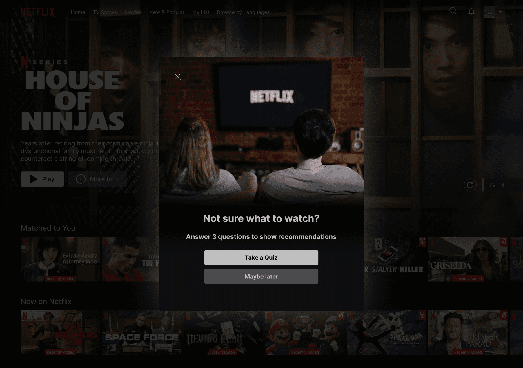
The pop-up window is a straightforward modal that asks three simple questions, making it easy for users to engage without feeling overwhelmed.
User Interaction: The quiz begins with the simple prompt, "Not sure what to watch?" giving users an easy decision point—take the quiz or skip it for now.
Question Progression: Each question is presented in sequence, with clear options, allowing for quick selection. The design ensures the user doesn't feel trapped or burdened by the process.
Recommendations: After answering the three questions, users are presented with tailored recommendations, reducing the time spent searching the vast content library.
The Outcome: A Fun, Time-Saving Feature
The Outcome: A Fun,
Time-Saving Feature
Although this was a side project, the concept has the potential to significantly reduce decision fatigue and improve Netflix users' experience. Based on the survey results, this feature could help users who feel overwhelmed by choice spend less time searching and more time enjoying their content.
This design isn't just about simplifying choice; it's about personalizing the user experience engagingly and helpfully. By slightly adjusting the browsing experience, users can feel more in control of what they're watching while reducing the frustration of too many options.
Reflection: Critical Thinking in Everyday UX
Reflection: Critical Thinking
in Everyday UX
From my curiosity about how things can be improved, this side project was a fun and creative way to apply critical thinking to many people's everyday problems. It allowed me to explore how we can enhance everyday user experiences by intuitively addressing decision fatigue. The quiz feature is just one example of how small, thoughtful design changes can impact a platform many people use regularly.
From my curiosity about how things can be improved, this side project was a fun and creative way to apply critical thinking to many people's everyday problems. It allowed me to explore how we can enhance everyday user experiences by intuitively addressing decision fatigue. The quiz feature is just one example of how small, thoughtful design changes can impact a platform many people use regularly.
Want to work together?
Want to work together?
Feel free to reach out at
Feel free to reach out at